The why
This project was completed as part of the Google UX Design Certificate. For this exercise, I created a mobile app based off of a randomly generated design challenge from Sharpen.
The what
The prompt for this challenge was: Create a staff scheduling app that allows busy retail managers to efficiently make their weekly schedules.
The who
I worked alone on this challenge, and was responsible for everything including—but not limited to—research, wireframing (both paper and digital), prototyping (low- and high-fidelity), design system creation, and user testing.
The how
To bring this project to life, I used pencil and paper for initial wireframes, Figma for digital wireframes and prototyping, and Jamboard for making affinity diagrams. From start to finish, I spent roughly 2 months working (part-time) on this.


Even though this prompt came to me ready-made, I still wanted to get a better picture of the problem it assumed was real: That making the schedule each week is time-consuming enough that it becomes a burden to retail managers.
Turns out it is.
In the average work week, managers who use paper or simple spreadsheets for scheduling can spend up to 20% of their time creating schedules for employees. And that’s just a reflection of the time it takes to put the schedule together. What that percentage doesn’t take into account is the time spent maintaining the schedule once it’s posted. This includes tasks like making sure shifts are covered if an employee calls out, dealing with shift swapping, staying on top of availability changes, fielding calls from employees asking for their schedules over the phone, etc.

With this information in hand, it became clear to me that simply delivering a way to “efficiently make” schedules wasn’t going to fully solve the problem in question. Since schedules are living documents, I needed to also consider what it takes to maintain a schedule once it’s posted.
With this in mind, I identified some additional pain points to consider while building out the app:


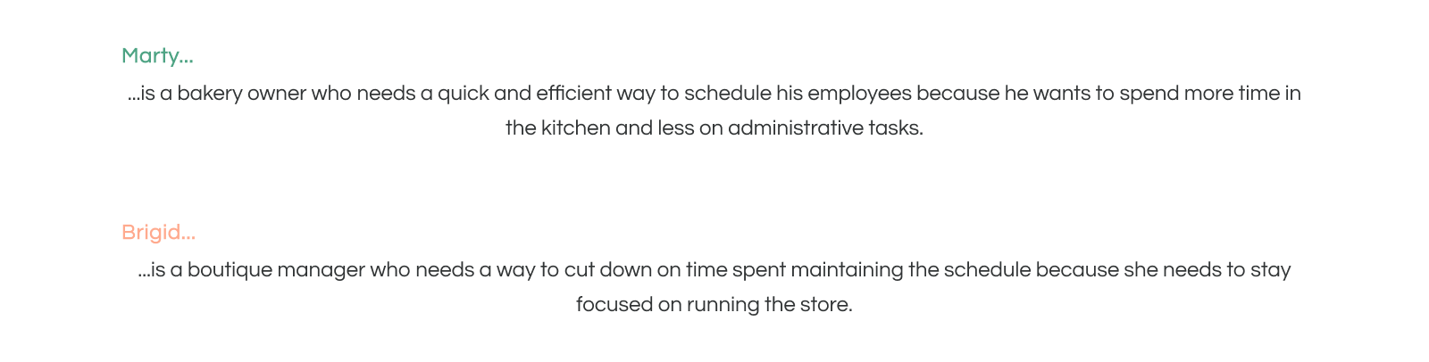
Based on what I learned from researching the problem, I created two personas: Marty and Brigid. Marty represents managers who are in the process of making their schedules, while Brigid represents managers who are maintaining schedules after they’ve been created and posted.


I also laid out journey maps for both personas:

The main thing I noticed while making these journey maps is that even though this challenge was focused on building a tool to help managers create schedules, most of the opportunities to improve their experiences lie with the employees. Features like self-managed availability, the ability for staff to swap and find coverage for their shifts, etc. move a good chunk of the responsibility for smooth scheduling from Marty and Brigid’s shoulders and distribute it amongst the employees.
Furthermore, it became increasingly apparent to me that in order for this app to work as intended it would ultimately need to include two different instances—one manager-facing and the other employee-facing.

Equipped with a better understanding of the challenges that Marty and Brigid face, I was able to come up with problem statements for both personas.


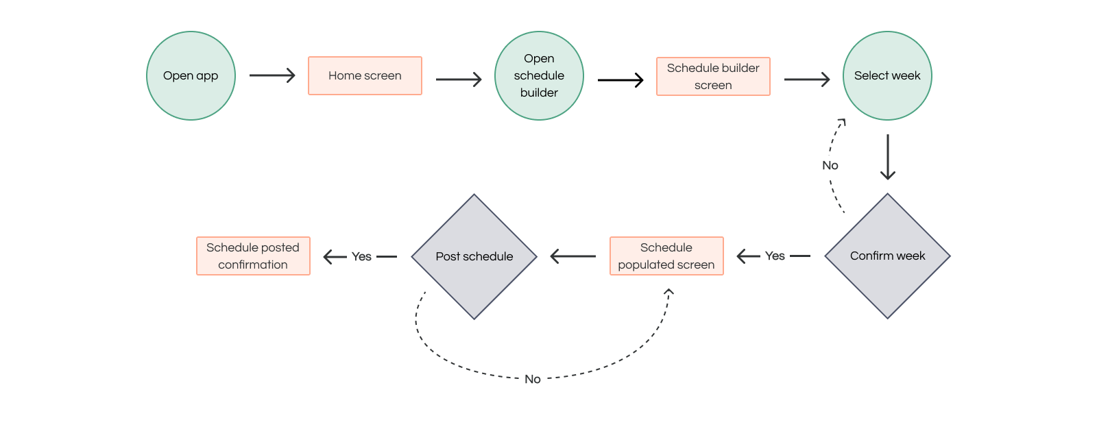
At this point in the process, it was becoming clear that a full solution to the challenge was shaping up to be much larger than just the schedule maker the prompt was asking for. However, since creating a schedule was at the heart of this exercise, I decided to focus on fleshing out the user flow for the app’s schedule builder feature.

Before I started mapping out the flow, I thought it would be helpful to identify the elements the schedule builder should include in order to stay in line with the ask—a quick and efficient way for managers to create schedules. After some brainstorming, this is what I came up with:

Keeping each of these necessities top-of-mind, I created the user flow.

Based on what I learned from Marty’s scenario, I started wireframing ideas for the home screen and schedule builder. I started with some sketches on paper:


Then, using the user flow diagram as my guide, I finished up the process in Figma with digital wireframes:


The goal of this usability study was to get an idea of how easy (or difficult) it was for real-life people to progress through the user flow from beginning to end. I wanted to find out which aspects of the schedule builder were most intuitive to users while also uncovering any pain points.
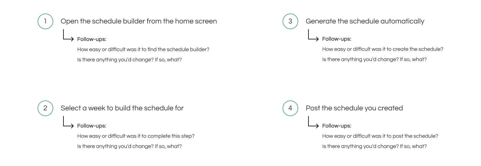
For the study itself, I presented five participants (between the ages of 32 and 73) with a low-fidelity protoype of the user flow plus the following four tasks and follow-up questions:

As I was conducting the study, I kept track of the participants’ responses and suggestions in a spreadsheet. Then, I organized everything that I collected into an affinity diagram.

From this more consolidated view, I was able to identify some telling patterns in the data that would later help me determine what updates I’d need to make to my wireframes. Those takeaways were that...
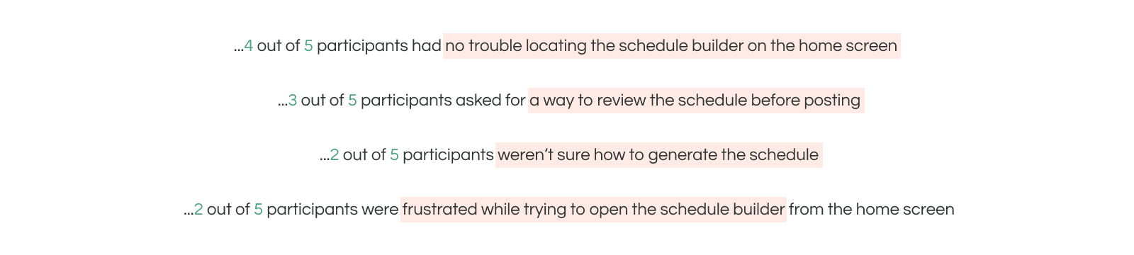
When considering these patterns, it became clear to me that people needed three things to progress through the flow more easily: a more obvious way to review their schedules before posting them, a more straightforward way of creating their schedules, and a more intuitive way of interacting with the home screen.


Keeping these three changes in mind, I tweaked the existing wireframes to create an improved second version of the schedule builder flow.


Before laying out the mockups, I put together the bare bones of a design system. I figured that if I knew the details of how some of the app’s building blocks (i.e. typography, color palette, and iconography) would look first, the mockups themselves would come together more easily.
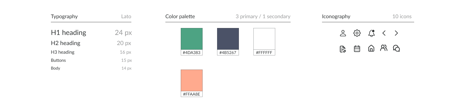
Once I had these details squared away, I used them (in addition to the updated wireframes) to inform the look of the mockups.


The main thing I took away from working on this project is that design challenges like this are limiting to some extent. I felt this especially at the beginning of the process, when I first sat down to tackle the prompt. Everything was already laid out for me—the assumption that the problem the prompt presented was real, that said problem was in need of a new solution, and that the right solution to the problem could be found in designing an app.
This exercise also showed me that there can be more to an ask than what is directly being asked for. At first glance, the prompt was just looking for a way for managers to make their schedules quickly. However, when I looked at it more closely, I realized that there were a few other things that weren’t explicitly being asked for, but would be needed in order for the schedule builder to work correctly. For example, in order for an auto-schedule function to exist, there’d also need to be a way for employees to add their availability, input any time off requests, etc.
Lastly, it became very clear to me just how important user testing is. What seems obvious to me isn’t always going to be as obvious to others, and vice versa.

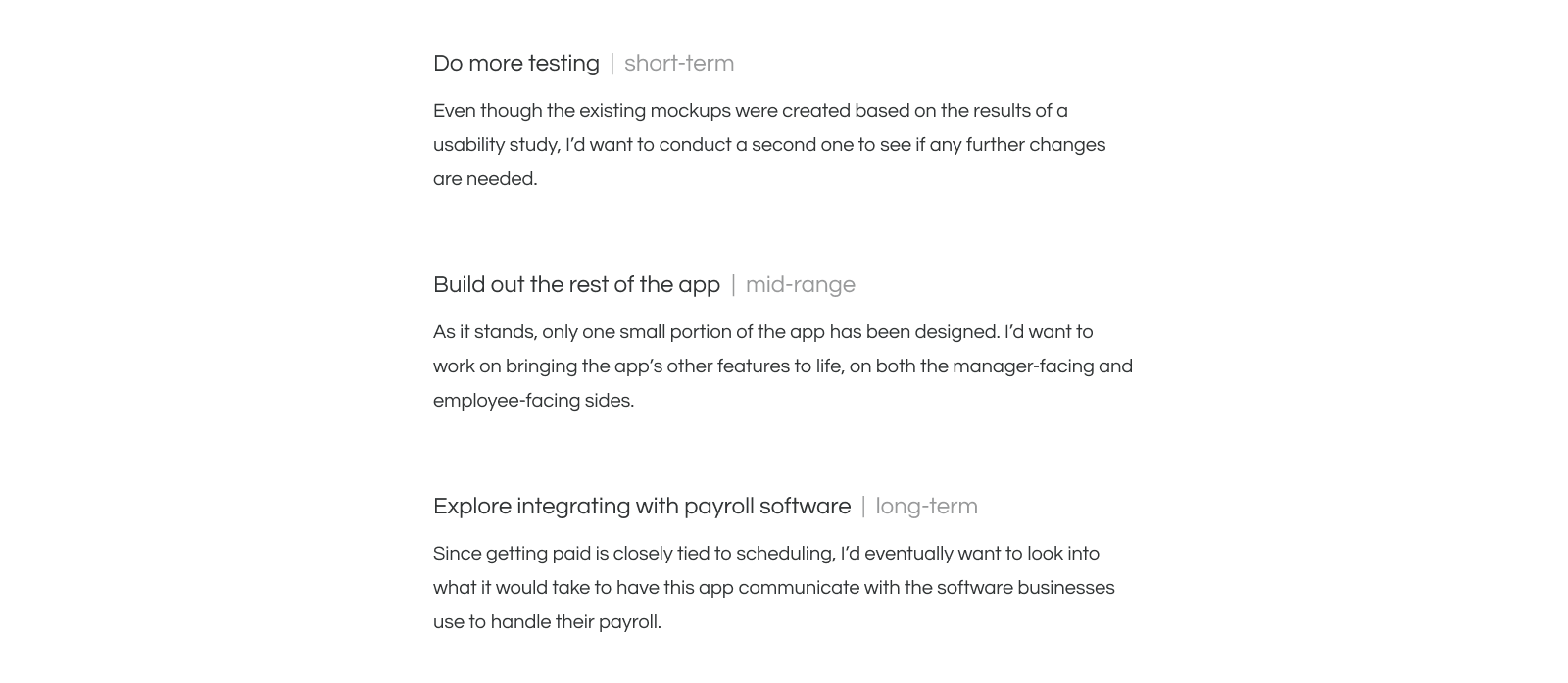
Since this was a design challenge for a speculative app, there isn’t a real-world need for any future work on the project. That being said, if this was a real case, moving forward I’d want to: